The Need for Alternate Tibetan Fonts: Bridging Tradition, Universal Design, and Modern Aesthetics
Drawing lessons from the successful modernization of scripts like Japanese and Arabic, alternate contemporary Tibetan fonts can empower readers, foster literacy, and ensure the language remains dynamic and relevant for future generations.
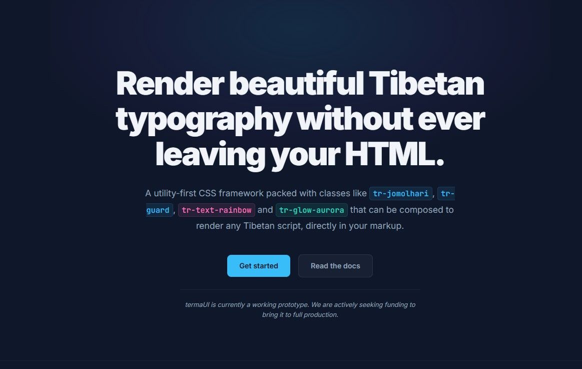
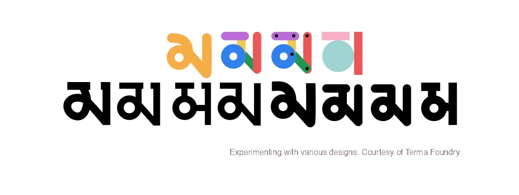
Experimenting with fonts. Termafoundry.com
Introduction
The Tibetan script, celebrated for its exquisite detail and profound cultural significance, faces formidable challenges in an era defined by digital technology, global communication, and rapidly evolving design standards. Despite its historical importance, traditional Tibetan typography often struggles to adapt to modern platforms, limiting its usability and appeal—particularly among younger, semi-literate Tibetans born in exile who can speak the language fluently but find writing it laborious. These individuals, who should be the torchbearers of linguistic heritage, frequently hesitate to fully engage with the script due to the visual complexity and difficulty of current font designs.

To ensure Tibetan remains vibrant and accessible, we must develop alternate contemporary fonts that uphold cultural authenticity while embracing simplicity, functionality, and neutrality. These contemporary fonts are not intended to replace traditional designs but to provide alternative choices that refine visual complexity, align with universal design principles, and optimize for digital media and multilingual documents. This approach empowers learners, supports cultural preservation, and enhances the script’s global presence.
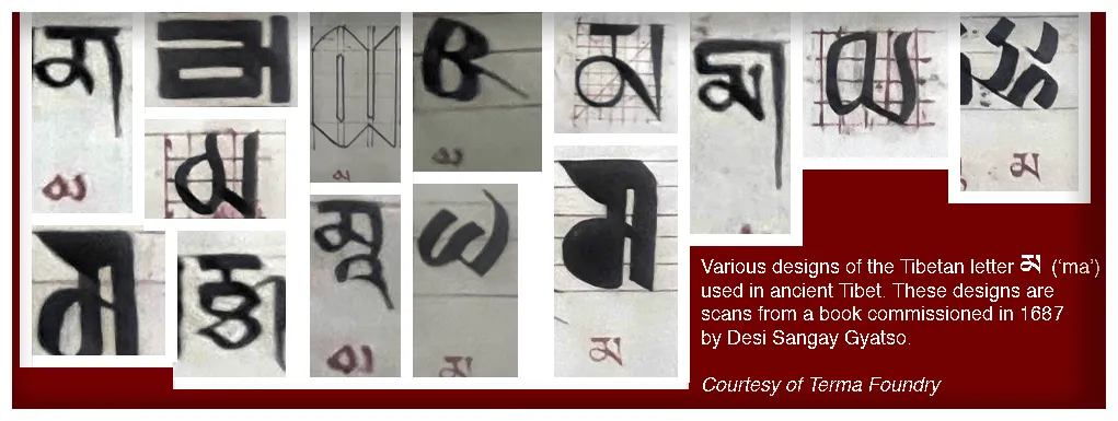 Historically, Tibetan script evolved with diverse typefaces tailored to specific needs, from government seals and religious manuscripts to decorative inscriptions on monastery pillars and woodblock printing for sacred texts. These designs were practical adaptations to their contexts, demonstrating the flexibility of Tibetan script. However, the fonts currently available for use on computers are based on traditional uchen and umey styles, offering limited variety. While these fonts preserve the ornate beauty of the traditional script, they are often too intricate for beginners, not optimized for digital screens, and lack accessibility for semi-literate users or children. This restricted range contrasts with the historical adaptability of Tibetan typefaces and highlights the need for alternate contemporary designs to address modern challenges.
The very purpose of a written language is to ensure communication, preserve culture, and facilitate learning. If people, particularly younger generations, find the script too intimidating or difficult to engage with, interest in reading and writing Tibetan will inevitably wane. This disinterest threatens the transmission of the language and culture to future generations, defeating the fundamental purpose of a written language.
Alternate fonts are not just a design choice; they are an educational and cultural necessity. Simpler, more legible designs can improve literacy, foster confidence among new learners, and adapt seamlessly to the needs of the digital age. These fonts can be tailored for children’s education, digital readability, and multilingual integration—ensuring that Tibetan remains a living, functional language that evolves with its users.
The Current Challenges
Semi-Literacy and Limited Engagement
Many Tibetans born and raised in exile are only semi-literate in Tibetan. They can converse fluently and recognize basic words but struggle to write a single page of text in their native script. This disconnect stems in part from the complexity of traditional fonts, which are visually intimidating and hard to master. Without accessible, learner-friendly typography, their confidence and inclination to improve literacy remain low, jeopardizing the transmission of the language to future generations.
Ornate Structure and Digital Limitations
- Intricate Details and Pixelation:
Tibetan fonts often feature intricate details and varying stroke widths, which, while artistically significant, blur on pixel-based displays. This loss of clarity makes reading more strenuous, particularly on digital platforms like mobile apps and e-books.
Multilingual Integration Challenges
- Character Width, Line Height and Spacing Considerations:
-
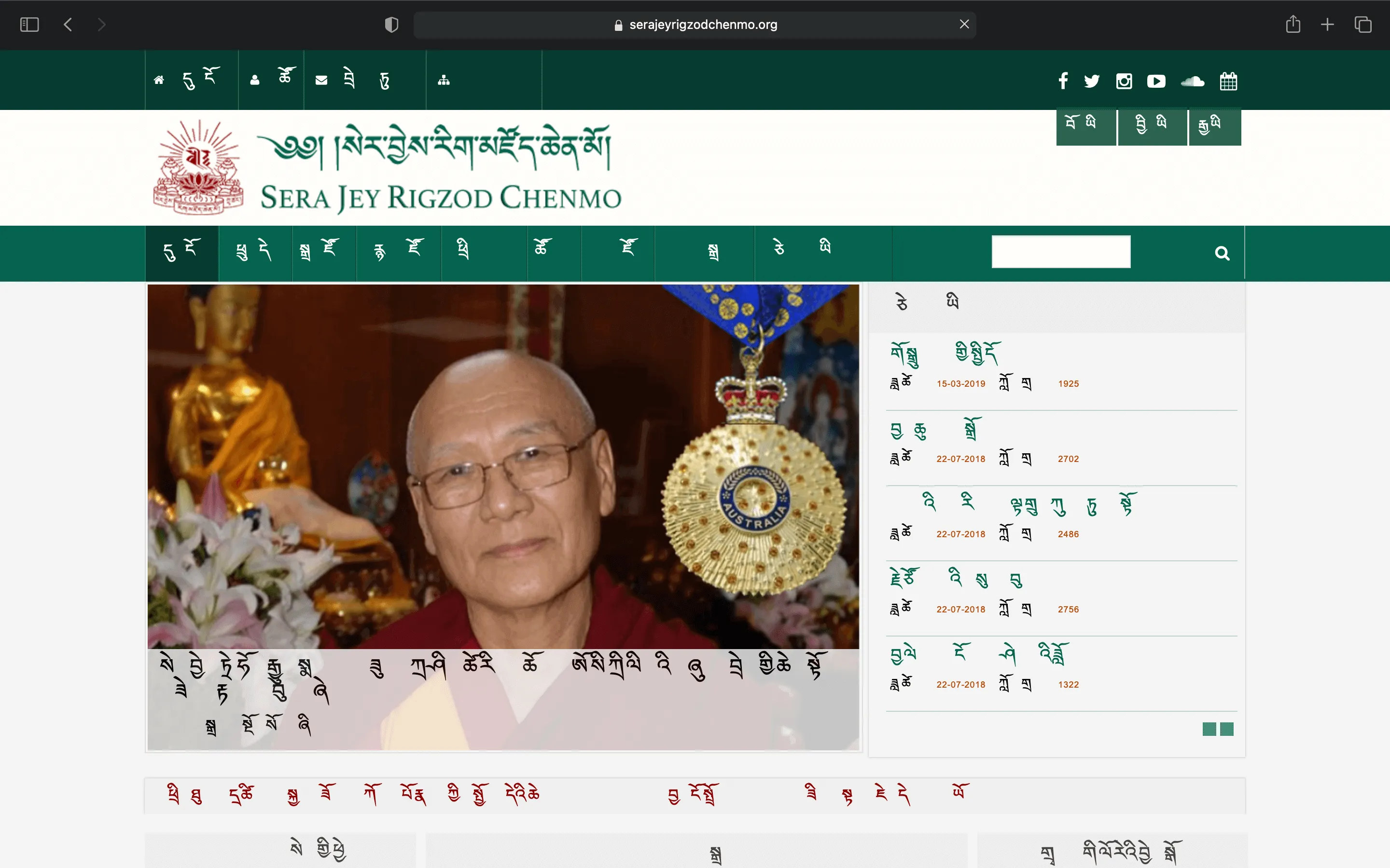
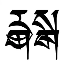
Tibetan fonts often span greater horizontal and vertical space compared to Latin scripts, causing alignment issues, inconsistent line breaks, and disrupted readability in multilingual documents.

-
Spacing Inconsistencies: Incorrect vertical spacing further disrupts the reader’s flow, making it harder to move seamlessly from line to line.
-
Lack of Alignment with Universal Design
-
Universal Design Principles Unmet:
Tibetan’s traditional fonts struggle to meet principles such as Equitable Use, Flexibility in Use, Simple and Intuitive Use, Perceptible Information, Tolerance for Error, Low Physical Effort, and Appropriate Size and Space for Approach and Use. Without these principles, fonts remain less accessible, intuitive, and inclusive.
-
Cognitive Processing Hurdles:
Gestalt theory’s principle of simplicity suggests that humans process simple, orderly shapes more quickly than complex or irregular forms. Currently, Tibetan fonts often present complex letterforms that slow down cognitive processing. This visual complexity makes it harder for readers—especially learners and semi-literate individuals—to recognize and comprehend text swiftly.
Designing for Simplicity and Usability
Unified Visual Aesthetics
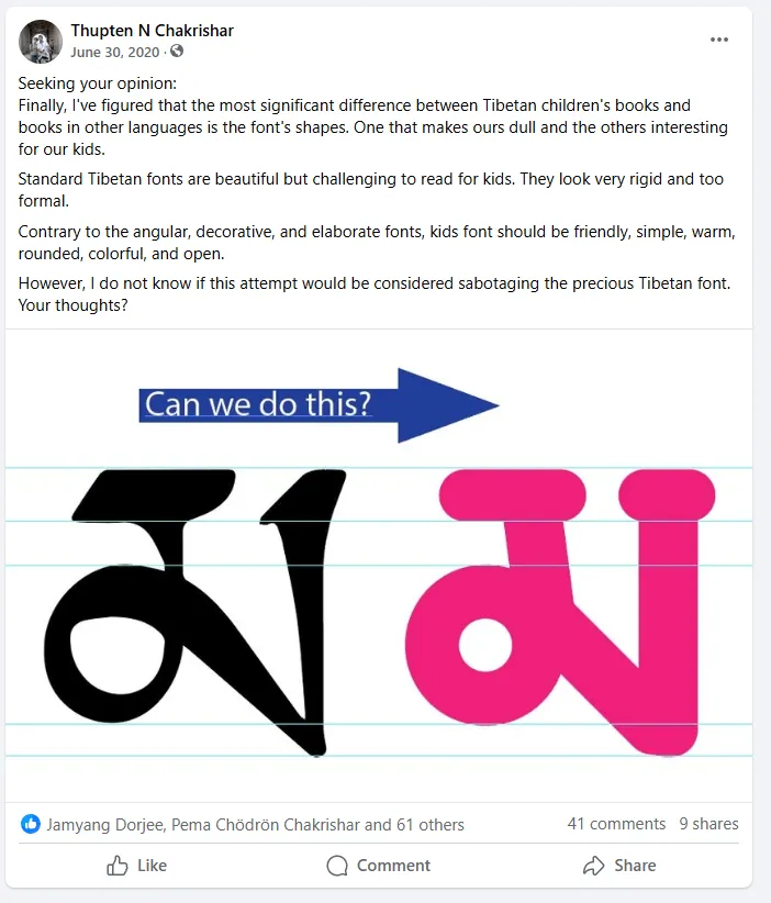
Our modern approach should emphasize even stroke widths, geometric shapes, and balanced proportions. By creating a coherent, harmonious appearance across all characters, we reduce visual clutter and foster a more inviting reading environment. This unified look enables readers to engage with the script more confidently, promoting literacy and daily use.
Simplicity to Enhance Recognition
By reducing ornate details, we can develop fonts that simplify character shapes, improving cognitive processing speed. Readers will identify letters more quickly, aiding comprehension and making Tibetan suitable for everyday reading in digital and print contexts.
Emphasis on Functionality, Legibility, and Neutrality
Prioritizing clarity over decorative complexity ensures that learners and casual readers can approach the Tibetan script without intimidation. Stripping away unnecessary flourishes allows for smooth integration with modern interfaces and multilingual documents, facilitating use in educational materials, branding, packaging design, and user interfaces.
Reflecting Tradition through Modernist Principles
Honoring Cultural Heritage While Innovating
Creating alternate contemporary Tibetan fonts is not about erasing tradition. Instead, it involves distilling the script’s essence—its cultural and religious depth—into forms that adapt seamlessly to current reading habits and technologies. Balancing authenticity with modernist design principles helps keep the language dynamic and relevant.
Learning from Global Precedents
Other languages, such as Japanese and Arabic, have modernized their scripts by simplifying designs for digital compatibility while retaining cultural authenticity. Tibetan fonts can follow a similar path, ensuring broader accessibility without losing tradition.
Cultural Preservation Through Accessibility
Empowering Future Generations
Increased legibility and simpler letterforms will empower semi-literate Tibetans to become fluent writers. By improving the reading and writing experience, we bolster cultural resilience and ensure that the language remains a living, evolving tradition, deeply ingrained in everyday life.
Facilitating Education and Content Creation
Teachers and content creators benefit from standardized, user-friendly fonts that make producing textbooks, storybooks, websites, and apps easier. Improved typography will encourage more Tibetan content, enriching the language’s literary and digital landscape.
Global Communication and Exchange
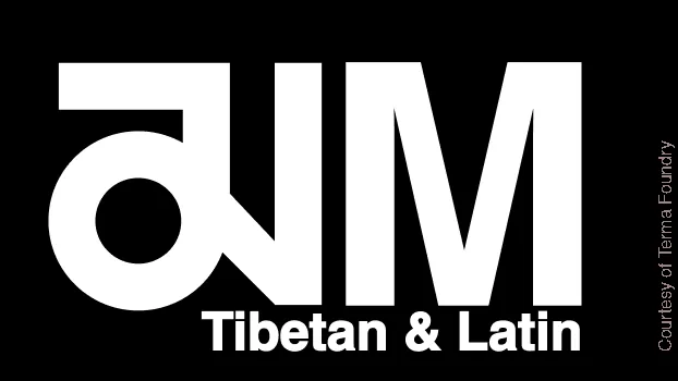
As more documents become multilingual, well-designed Tibetan fonts can coexist harmoniously with Latin scripts like English. This improves the presentation of bilingual materials—be they scholarly texts, user manuals, or tourism brochures—ensuring clear communication and cultural exchange on a global stage.
Conclusion
Creating alternate contemporary Tibetan fonts is a strategic and culturally significant endeavor. By refining character shapes, adhering to universal design principles, and simplifying intricate details, we make the script more readable, approachable, and versatile. Drawing inspiration from languages like Japanese and Arabic, which have successfully modernized their fonts, we can confidently demonstrate that this evolution is a testament to resilience rather than a departure from tradition.
This adaptation will foster higher literacy rates, particularly among exiled Tibetans who yearn for deeper engagement with their language, while reinforcing the Tibetan identity in a globalized, digital age. Creating alternate contemporary Tibetan fonts affirms the script’s enduring vitality, encourages daily use, and positions the language confidently among the world’s great writing systems—resilient, adaptable, and poised for future generations to cherish and employ.
This article is a call to action for Tibetan graphic designers, artists, and scholars to join in this effort. By developing alternate fonts, we can ensure that Tibetan script evolves, thrives, and remains deeply embedded in the lives of future generations. Let us work together to expand the possibilities of our written language while safeguarding its timeless essence.
Disclaimer: The insights and narratives shared here are purely personal contemplations and imaginings. They do not reflect the strategies, opinions, or beliefs of any entities I am associated with professionally. These musings are crafted from my individual perspective and experience.